
 610.432.2600
Three Seconds to Find the Phone Number,
or the Visitor Is Gone.
A visitor who cannot find the phone number in three seconds rarely looks for a fourth. The exit is not anger. It is habit. The next search result sits one tap away, and it wins by default.
Project Snapshot: The 5 Ws
The Parameters of UX Design
The Who
The What
The When
The Where
The Why

Who: The Visitor Being Designed For
The Distracted User: Most visitors scan a screen for one specific thing and skip the rest of the page. When that thing stays hidden, they drop the task and move on.
The Business Stakeholder: Business owners often blame low conversions on traffic volume. The bigger issue is what happens after visitors arrive and cannot act on what they see.

What: The UX Work
Friction Identification: Friction shows up at the exact points where a visitor gets confused or stuck. Those moments push people to quit before they finish the action they came to complete.
Architecture and Flow: Clear paths come from structured navigation and a deliberate order of steps. The route from arrival to action stays short and asks for as few decisions as possible.

When: The Trigger for UX Investment
When Traffic Is Not Converting: Pushing more traffic into a broken flow only produces more abandonment. High session counts paired with low conversions point to a UX problem, not a traffic shortage.
Before Development Begins: Catching UX problems before development starts costs far less than fixing them once they live in built code. The price climbs again after launch.

Where: The Surfaces Being Designed
Every Screen Size: A navigation pattern that works on one device can fall apart on another. Testing across screen sizes from the start catches those breakpoints early.
Every Step in the Conversion Path: Every step from the first landing page to the final confirmation screen gives a visitor a reason to leave. Careful UX work tightens each of those handoffs.

Why: The Business Case
Conversion Rate Impact: Small gains stack up fast across a multi-step flow. A 20% improvement at each of three steps produces about a 73% lift in conversions on the same traffic.
Support Cost Reduction: Content that answers common questions on the page cuts the number of calls asking those same questions. Fewer repeat calls means lower support labor cost.

UX Design vs.
UI Design
UX and UI Are Different Jobs With Different Outcomes
A polished surface can hide broken structure underneath. A site that looks professional still loses conversions when the experience beneath the design does not work.
The most common complaint sounds the same across projects. The site looks impressive but brings in no leads. That gap traces back to UX problems wearing the costume of a visual one.
User Research & Personas
The Owner Knows the Product; the Visitor Does Not
Owners know the jargon, the catalog structure, the internal names for things. A first-time visitor knows none of that. They showed up with a problem and want a quick match for it.
Research Methods and Bias Removal:
Interviews, session recordings, and behavioral analytics show how visitors really move through a site, not how the team assumes they do. Say the team is sure the pricing page is easy to find. Then a recording shows 60% of the visitors who hunt for pricing give up before they reach it. Both claims cannot hold. The recording wins. Research swaps the guess for what happens on the screen.
Personas as Design Constraints:
A persona is a documented profile of the main visitor type built from real data. It records demographic, device, intent, and the exact question that visitor arrives with. Designing for a named persona with fixed constraints leads to different choices than designing for a vague average user. A 52-year-old facilities manager on an iPad at a job site has a different tolerance for fussy navigation than a 28-year-old on a phone at home. One design cannot serve both at once. The persona names which one it favors.
The toughest conversation in this work is a simple one. The site is not built for the owner. It is built for the visitor the owner has not met yet.
Information Architecture
Navigation Has to Speak the Visitor’s Language, Not the Company’s
Internal language rarely means anything to an outsider. A visitor meets a label like “Solutions” with no context and no idea what sits behind it. The word reads as empty, and people move on fast.
Card Sorting and Navigation Labels:
Card sorting hands real visitors a pile of unsorted topics and asks them to group those topics in a way that feels natural. The groupings often clash with internal assumptions about how the site should be organized. When people file pricing under an ‘About’ section, the navigation should follow that mental map instead of the company org chart.
Sitemap Structure and Depth:
Every extra level of navigation adds one more decision and one more chance to lose the visitor. A flat structure with clear top-level labels keeps those decisions to a minimum. Deeply nested menus with vague headings send people the wrong way, and the result shows up as shallow page depth and high bounce, not as an admitted navigation failure.
Navigation that needs no guessing produces no drop-off. Plain and predictable beats clever and vague.
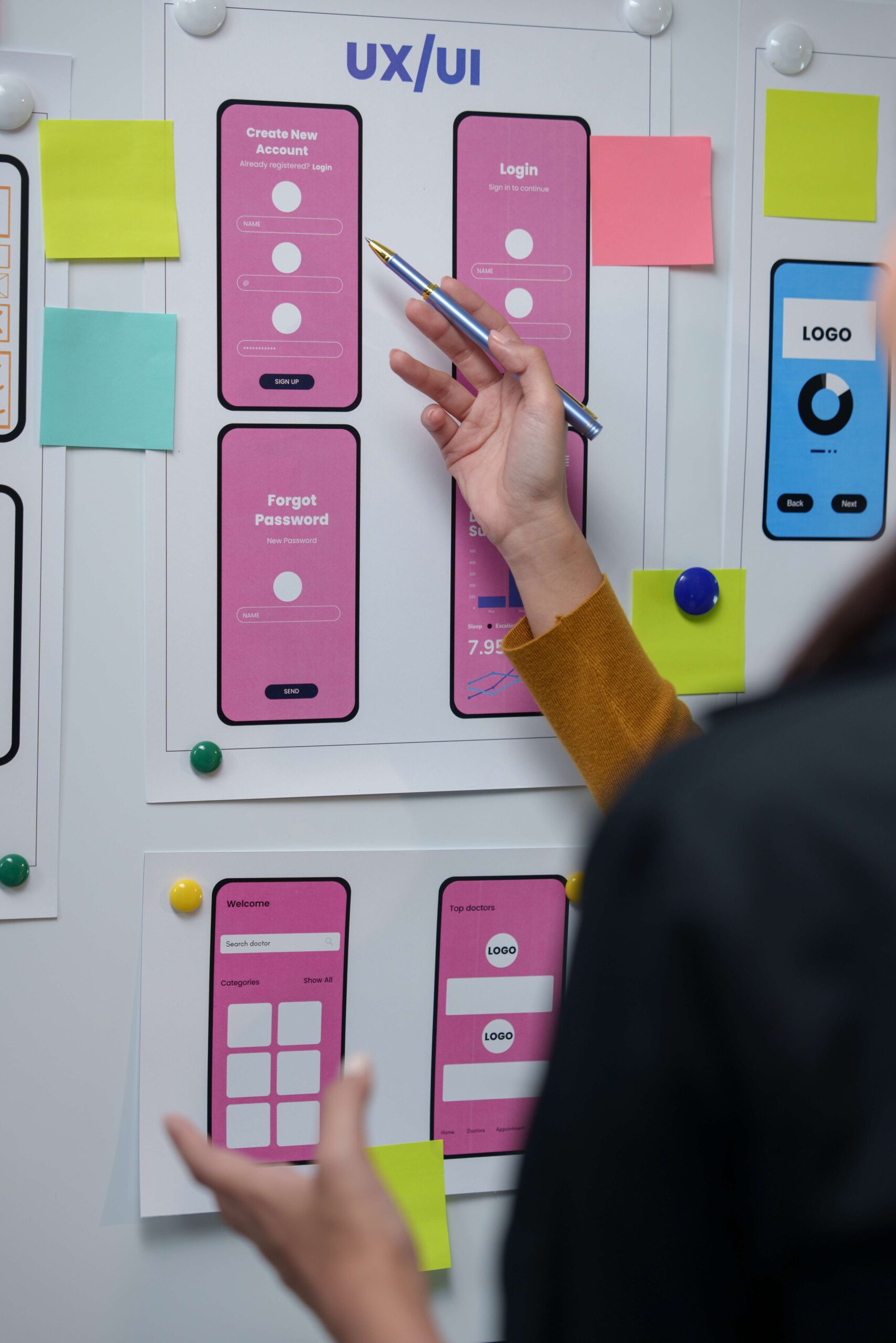
Wireframing & Prototyping
Structural Fixes Are Cheap in Wireframes, Expensive in Code
A structural problem caught in a wireframe costs hours to fix. The same problem caught after development costs days. Caught after launch, it costs weeks and ties up a developer on a live site.
Low and High Fidelity Wireframes:
Low-fidelity wireframes are rough sketches. They fix layout, content order, and navigation flow with no color and no styling, which lets structural questions get answered fast. High-fidelity wireframes then add real spacing, real content, and interaction states. Each belongs to a different stage. Jumping straight to high fidelity before the structure is settled hides the structural flaws under a layer of polish, where they get much harder to spot.
Clickable Prototypes and Usability Testing:
A clickable prototype mimics the finished experience with no code behind it. Hand it to a test participant, name one task such as booking an appointment, finding the service page, or sending an inquiry, and watch where the flow breaks. That break shows up before a single line of code exists. A participant who stalls in the prototype will stall on the live site too, and the prototype is the cheaper place to fix it.
Each flaw caught in a prototype is one change order that never lands on the development invoice.
Mobile UX & The Thumb Zone
The Thumb Decides What Is Easy to Reach on Mobile
A phone is held and worked mostly by one thumb, yet many layouts ignore that in favor of looks. During one-handed use the thumb rests over the bottom third of the screen, so a primary button parked at the top sits just out of easy reach. That single choice slows people down and makes the whole interaction feel harder than it should.
Touch Target Sizing and Spacing:
Platform makers and accessibility guidelines land on the same number. An interactive element should be at least 44 by 44 CSS pixels so taps do not miss. Correct size alone is not enough. When neighboring targets sit too close together, taps still land on the wrong one. Navigation menus are the classic case, where list items with only 8 pixels of vertical padding produce constant misfires and messy analytics.
Fitts’s Law and Interaction Efficiency:
Fitts’s Law sets a basic rule for mobile design. The size of a target and the distance to it drive how fast and how accurately a person can hit it. So primary actions belong where the thumb already sits, and they should be large. Small targets placed high on a long page force either a scroll or a grip change, an unnecessary hurdle that breaks the flow.
Mobile UX is a matter of physical reach before it is a matter of looks.
Accessibility & Inclusive Design
Accessible Design Improves the Experience for Everyone
Work done for accessibility helps people without disabilities too, especially in rough conditions. High-contrast text that a low-vision reader can follow is the same text that stays legible on a phone in bright sun. Large touch targets that help someone with a motor impairment also help anyone tapping one-handed.
Contrast, Focus States, and Error Messages:
Normal text needs a contrast ratio of at least 4.5:1 against its background, and a lot of light gray body copy quietly fails that check. A focus state is the outline that marks whichever element the keyboard has landed on, and a keyboard user without one loses their place on the page. Error wording carries the same weight. A message that reads “Invalid input” leaves the visitor guessing, while one that reads “Phone number must be 10 digits, numbers only” names the exact fix. The second version cuts form abandonment for everyone, not only for people with a disability.
ADA Legal Exposure and WCAG Compliance:
Title III ADA lawsuits against websites have climbed every year since 2017. The standard most courts point to is WCAG 2.1 AA. When accessibility is left out of the design brief, it gets bolted on afterward at higher cost, again after an audit or a complaint. Building it in from the start costs less and serves the whole audience better.
Roughly 26% of adults live with some form of disability. Design that ignores access shuts them out. It also shuts out anyone whose ability is dialed down for a moment by their surroundings.

Cognitive Load & Simplicity
Each On-Page Choice Chips Away at the Visitor’s Patience
Lost conversions pile up from a run of small decisions. One big obstacle can cost as much as five little ones. Every hurdle raises the odds that a visitor quits, whatever its size.
The goal was never minimalism for its own sake. It is a page where a visitor never has to stop and work out what to do next.
- Visual hierarchy ranks content by size, weight, and position so the most important thing lands first and no one has to hunt for it. Progressive disclosure shows only what matters at each step and holds the rest until it is asked for. Both cut the number of choices a visitor has to make.
- Visitors scan before they ever read, and that scan is how they find their way. Good design leans into it with short paragraphs, plain subheadings, and specific labels. A solid wall of text forces the slower reading mode, and most people bail rather than commit the time.

Usability Testing &
Behavioral Analytics
The Team Thinks the Site Is Clear; the Data Disagrees
Inside opinions do not decide the experience. When a session recording contradicts the design team, the recording sets the next move. Bounce rate and time on page describe outcomes and stop there. Behavioral tools show the moments that produced those outcomes: the click that landed on nothing, the form field where the flow stopped, the section 80% of visitors never reached. Running on aggregate numbers alone is debugging without a stack trace, and the diagnosis stays a guess until someone watches the recording.
 Heatmaps, Scroll Maps, and Rage Clicks
Heatmaps compress huge volumes of click and tap data into one picture that shows where attention gathers and where it never lands. An element stuck in a cold spot is usually both hard to see and easy to ignore. Scroll maps track how far down the page people actually get. When a contact form sits below the point 80% of visitors ever reach, the problem is placement, not styling. Rage clicks fill in the rest. Repeated rapid taps on an element that refuses to respond mark a broken interaction that never reaches an error log, because the element loads and renders exactly as written. It just fails to do the one thing the visitor expected of it.
 Form Analytics and Drop-Off Points
Form analytics find the exact field where completion stalls and people walk away. A 45% drop-off on the phone number field flags a specific snag. The usual causes are a field marked required that should be optional, the wrong keyboard on mobile, or a label vague enough to stall the person filling it in.

ROI & The Cost of Bad UX
A UX Fix Costs an Hour in Wireframes and Weeks After Launch
A problem caught in a wireframe takes roughly one hour to fix. The same problem caught after launch takes weeks. The gap in cost is not a guess. Development teams log the structural problems that surface at each stage, and each stage carries its own price.
- Cutting a checkout from six steps to three lifts conversions on the traffic already coming in. Trimming a form from seven fields to three raises completion rates the same way, with no extra ad spend.
- When visitors find clear answers on the page, fewer of them reach for the phone. If 30% of calls once asked which areas the business covers, a simple coverage map on the page ends most of those calls.
Bad UX shows up in several numbers at once. Conversion rate, support call volume, and bounce rate all move the wrong way. The bill keeps growing until the underlying problems get fixed.


Frequently Asked Questions
What is the difference between UX and UI design?
UX is the underlying logic of how people move through a site. It covers navigation labels, the order of form fields, and the build of the conversion path. UI is how that structure gets dressed, through color, type, spacing, and imagery. A polished site that still confuses people has a UX problem. A site that works well but looks rough has a UI problem.
What is the difference between UX and CX?
UX covers how someone interacts with a digital product such as a website or an app. Customer experience, or CX, covers the whole relationship with the company, from sales calls to service delivery, follow-up, and invoicing. UX is one important piece of CX, and fixing that piece does not fix the rest on its own.
How long does a UX audit take?
A full audit usually runs two to three weeks. It covers an analytics review, a heuristic check against known UX principles, a pass through session recordings, and interviews with stakeholders. The output is a ranked list of specific problems at exact points in the conversion path, each paired with a recommended fix.
Does UX design affect SEO?
Search engines weigh engagement signals such as time on page, bounce rate, and pages per session to judge whether content matches what visitors wanted. Better UX tends to mean longer visits, lower bounce, and more movement between pages, and those are the signals that read as quality.
What is a dark pattern in UX?
A dark pattern is an interface built to push people into actions they never meant to take. Common ones include pre-checked opt-in boxes and cancellation flows made needlessly hard to finish. They can lift short-term numbers, but they wear down trust and now draw steady attention from regulators.
What is above the fold and does it still matter?
The part of a page visible before any scrolling carries a lot of weight in whether a visitor stays. The main value proposition and the primary call to action both belong there. People will scroll, but only once that first view gives them a reason to.
How are mobile menus handled in UX design?
Mobile visitors recognize several navigation styles, from the hamburger icon to a bottom navigation bar. The right choice depends on how many destinations a site or app has and how often people jump between them in a single session.
Who owns the wireframes and design files after the project?
A UX engagement hands over wireframes, prototypes, personas, and design assets. The client owns all of it as part of what they paid for, and that library sets the groundwork for whatever gets built next.
Does fixing UX require rebuilding the entire site?
Not every fix means starting over. Small changes like reworking button copy or moving a call to action often happen on the existing site with no overhaul at all. A full rebuild only comes into play when the structure itself is broken, such as a page hierarchy that does not hold up or a mobile experience that needs a different architecture.
Why does whitespace matter in UX design?
Whitespace builds hierarchy just as much as size and weight do, by separating elements and steering the eye. A cramped page loads visitors with extra mental work, while an open one walks them straight to what matters.
Available in Your City

Google partner
Premiere Agency